ShopDreamUp AI ArtDreamUp

Deviation Actions


Description
An entry for Mythical Scene Contest by artnouveau

Mixed media: Watercolor; gouache; black, cream, yellow ink; color pencils; drawing pens on paper.
Stocks used:
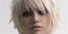
Pose reference: Damsel by TwilitesMuse
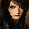
Greek cloth reference: Grecian girl pouring glass stock II (2015) by QueenWerandra
Pithos references:
Book: Myths and Legends from Around the World by Sandy Shepherd & Tudor Humphries
(Wow thank goodness I happen to own this book, great for myth references.") )
)
Pottery 02 PNG Stock by Roy3D
Wikipedia: Pandora's Box
Comments and/or critiques are welcome, feel free to give your thoughts regarding my artistic skill, elements, or symbolism in this specific setting. (Smile)")
Mythic Scene Contest (9 contestants)Hello everyone!
Since we had less than ten participants before the deadline the contest has been extended for a (little over a) month. Hopefully everyone who answered in our last poll that they needed more time will be able to participate with the extra time.
To those who have already submitted: remember that you are welcome to make two entires in total. And it is also okay to revisit your submissions, before the new deadline, if you realize there's something you want to change.
To everyone: remember to read all the requirements carefully, and make sure that you are illustrating a scene from a myth and not just drawing a person/being from a myth!
Hello lovely deviants. A theme has been chosen, prizes are accumulating, and our 2016 contest can begin!
Theme
Thank you to everyone who voted. As usual we will save the rest of the themes as possibilities for our future contests. The theme that was chosen is the following:
Mythic Scene: Illust
Mixed media: Watercolor; gouache; black, cream, yellow ink; color pencils; drawing pens on paper.
Stocks used:
Pose reference: Damsel by TwilitesMuse
Greek cloth reference: Grecian girl pouring glass stock II (2015) by QueenWerandra
Pithos references:
Book: Myths and Legends from Around the World by Sandy Shepherd & Tudor Humphries
(Wow thank goodness I happen to own this book, great for myth references.
Pottery 02 PNG Stock by Roy3D
Wikipedia: Pandora's Box
Comments and/or critiques are welcome, feel free to give your thoughts regarding my artistic skill, elements, or symbolism in this specific setting.
Image size
1222x1629px 779.24 KB
Comments11
Join the community to add your comment. Already a deviant? Log In
I would like to apologise for the delay in commenting on this.
Anyway, Art Nouveau, gosh, why is it that it always ends up so beautiful? And yet, I know very little about it. But I know that it tends to involve pretty framing, dynamic compositions, organic curves, a heckload of detail and - for reasons yet unknown to me - mostly women. And what can I say? I'd say it's perfectly executed. In fact, I have no idea how you did it, this looks smooth enough to be a digital creation - which is not to say that digital art is better, but this speaks volumes about both your skill and your knowledge about how to make it representable on a digital platform. <img src="e.deviantart.net/emoticons/c/c…" width="20" height="20" alt="
OK, let's break it down.
- The frame might be my favourite part. It's amazing and I can't imagine how much time went into this! The shading and colouring and outlining everywhere, it's just perfect! The swirls and the organic curves are amazing. And to top it off, you add an extra layer of depth into the overall creation by making it go over or under the scenery, depending on where on the z-axis things are.
- Details. Oh yes, there are lots. But you considered well which parts to abstract. In the fashion of Art Nouveau, cloth and hair are most intricate.
- Shading. As minimalist as the shading is - almost being cell shading in some parts - it is practically everywhere. Very style-consistent and very impressive.
- Colours. OK, so this is where my personal taste interferes. I love the red and the green and the yellow and the white (and they're all so pretty!)... but I'm not a fan of the shades of brown - and even less of the weird colours on the. Um. Evils. This is not about their design, more on that later, but I feel like while I can understand everything else, their colours clash with everything else. It's very unnatural comparatively. They're also very dark, unlike everything else in the image. Which might be your intention and you certainly did a good job on making them disturbing, but in terms of the thumbnail, it's what immediately stood out. I understand this is also part of their design, but everything around them is so dark, on a larger scale, almost all of the left half, which makes the image unbalanced, the one thing that sets it apart from other Art Nouveau paintings I've seen so far. There's even a stark contrast over Pandora's legs, it just really clashes. That's why my impact rating has only 3.5 stars.
- The composition is great. There are lots of dynamic S-shapes spanning through the entire image. And it goes around in a way that directs the viewer to prioritised parts first, very cool! There might even be some concentric framing going on here, slowly spinning towards the back. The depth is really great.
- As for your ideas. For some reason, I really appreciate the curtain. How you thought of it in this situation is beyond me, but it really fits nicely. The main focus of attention, however, should be the "box", which was originally a jar, nicely done! The evils unleashed into the world have a very impressive design! As much as I disliked them at first, their concept is really great. There are lots of layers here.
- Many-faced evil. I wonder if you have read up on ethics. I haven't, but I've come across something in that direction once. Anyway, the evils don't all look maleficent, some of them look like they suffer, which is how I understand most evil. Also very cool!
- Their shape is somewhat chibi-esque and the term "evil spirit" easily comes to mind here.
- The patterns on the evils remind me of several things, but I'll just mention the Greek meanders. It also makes them look ancient. Nice touch.
- I see some hidden treats. There are tentacles, of course, but the tentacles on the upper left align with a face so that they become horns. The faces on the bottom of the escaping evils remind me of tornados and anthropomorphic depictions of tornados. The bottom left face has an extra set of eyes serving as horns.
- They have different effects on their environment. As mentioned before, everything around them, even the frame, becomes darker (eviler?). Evil hurts, evil destroys, evil leaves cracks in the pillars. Evil pollutes, black blots surround them.
- The last bit I'll mention is that their design reminds me of Azazel in Neil Gaiman's Sandman.
- The whole thing also looks very Greek.
- This is really not important, but the perspective of the pillar right behind the pithos isn't quite right on the base.
- I have no idea what those flowers are! Do they mean anything? Aaaah.
- One of the rare occasions where I suggest to actually go in and edit part of the image digitally: There are red lines on the jar lid.
- The evils have sparks? They're sparks, right? Because right now, it looks a bit like stains or a damaged part of the painting. But other than visual effects, I have no idea what it might stand for.
This Critique was part of ProjectComment's Secret Santa Comments. Thank you for participating, and again, sorry for being late.